MOA has been extended in order to provide an interface to develop and visualize outlier detection algorithms. For that reason we have added a third tab named Outliers.
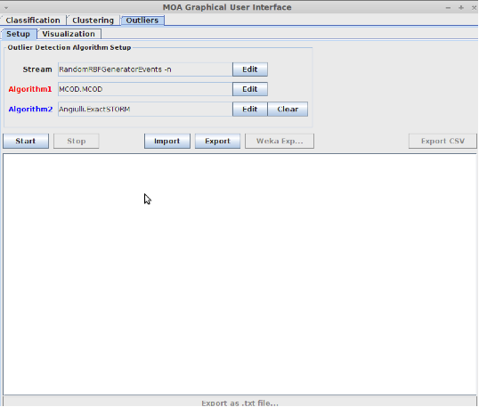
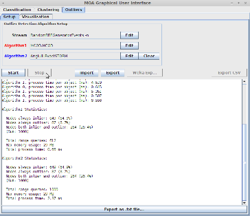
A screenshot of the Outliers graphical user interface can be seen at the figure below. The algorithm setup is very similar with that of the Clustering tab.
The setup consists of three parameters: the stream and the two algorithms. In order to change the configuration of each of these three parameters, the user can press the Edit buttons.
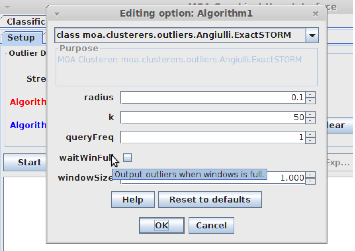
An example of configuration of the first algorithm is shown at the figure below. As shown, the user can choose one of the available algorithms and change the values of each parameter of the algorithm. By moving the curser over the name of a parameter, a message shows up with the description of the parameter.
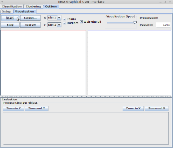
The following figure shows the visualization tab before pressing Start. There are many options that the user can change, like what to display (points, outliers), whether to wait the window to get full in order to display outliers, the visualization speed, the dimensions of the points displayed and the value of the pause interval.
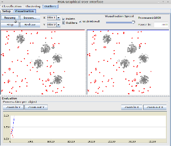
After pressing the Start button the visualization process begins and each point of the stream is shown. Two visualization screens are shown, one for each algorithm. The first algorithm specified at the Setup tab is shown with the red color, while the second algorithm is shown with the blue color.
The graph at the bottom of the window displays the “time per object” values (y-axis) of the two algorithms at each window slide (x-axis). In order to distinguish the graphs between the two algorithms, the colors red and blue are used.
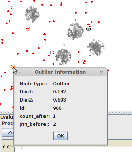
After 1000 window slides (which is the pause interval specified) the visualization process pauses and the user can see which points have been reported for each algorithm as outliers. Outliers are shown as red points, while normal points are shown as gray points.
The red circles displayed at the outliers indicate that a point has changed its state from inlier to outlier. On the other hand, the black circles show that a point that was an outlier has now become an inlier. By clicking at an oultlier point, a popup window is shown containing some useful information about the point. This information is algorithm specific.
Pressing the button Resume simply resumes the visualization process. The user can pause and resume the visualization, to see the current outliers, at any moment by pressing the corresponding buttons.
In order to stop the visualization the user can press the Stop button. After that, at the Setup tab, the program shows some statistical information about the two algorithms
